top of page

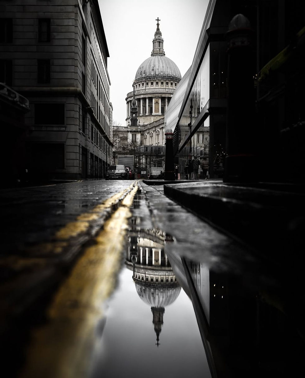
Photo Analysis: Dome Reflection

  • Writer: The Magazine For Photographers
    The Magazine For Photographers
  • 2 days ago
  • 3 min read
photo of a church dome in London

Photo by: @losttog


Let’s Analyse this Image:


Light & Atmosphere


What works well:

  • The soft, overcast light works really well here. It keeps everything evenly lit without harsh shadows, which is important for the reflection because it allows the puddle to stay very clean and readable.

  • The dome still has a good amount of contrast against the grey sky. It stands out, but it doesn’t blow out into white, so you still see all the detail in the stonework.

  • The darker tones around the edges of the frame act like a natural vignette, pulling your attention straight to the dome where it should be.

What could be better:

  • The sky is very flat, which isn’t unusual on a grey day, but even a little more detail brought out in post could add something extra to the background. Right now, it’s just a big white space.

  • The shadows on the right-hand building are really heavy. You lose a lot of the architecture there, and I think lifting them slightly would help show off more texture without distracting from the dome. Also this very dark shadow creates imbalance and the image starts leading to the right (the dark shadow is heavy).

  • The parked cars at the base of the dome are a bit of a distraction. Obviously, you can’t control that when shooting in the street, but darkening them a little in post would stop them from catching the eye.


Composition & Framing


What works well:

  • The low perspective is a great choice. Shooting from ground level gives you the puddle reflection, which makes the image far more interesting than just a straight shot of the dome.

  • The yellow line on the road is really effective as a leading line. It pulls your eye straight from the puddle reflection up to the real dome, tying both halves of the frame together.

  • The symmetry works well too. The dome is framed neatly between the buildings, so it feels intentional rather than accidental.

  • The reflection itself is sharp and clear, so it almost feels like you’ve got two domes stacked on top of each other.

What could be better:

  • The foreground is very dominant. The lines and puddle exaggerate the leading effect nicely, but they do start to overwhelm the composition a little. It makes the lower half feel heavier than the top. Tilting the camera up slightly or not getting quite so low to the ground might have balanced that better, but as always this could come at the cost of decreasing the effectiveness of the leading lines.


Emotion & Story


What works well:

  • The mood here is very quiet, it is obviously just after rain, and the street feels empty and still. That calmness suits the scene well.

  • The reflection adds a special touch. It feels like you see a different version of this very famous landmark (although to be fair these reflection shots are becoming more common).

  • It’s a very “London” scene: grey sky, wet street, and the iconic dome, which also gives you an immediate sense of location.

What could be better:

  • The scene is a little too still/lifeless. Having a passerby, maybe someone with an umbrella, would add a bit of life and movement to the scene. And actually, if you look closely, on the right side of the side walk (opposite to the cars) you can actually notice a couple walking. However they are absolutely hidden in the shadows so that you really cannot see them. Lifting up the shadows there could help.

  • At the moment, it leans more toward being a strong architectural photo. A subtle human element would give the shot more of a story to connect to.


Colour & Tone


What works well:

  • This sort of selective colour works nicely. The yellow lines stand out against the otherwise muted, monochrome palette, and that contrast gives the frame its energy and visual interest.

  • The overall tonality suits the weather, it’s soft and controlled, with enough contrast to hold detail without being harsh.

  • The reflection carries the tones well; nothing feels muddy, and the image reads clearly top to bottom.

What could be better:

  • The yellow line is maybe a little too strong. It works as a leading element, but it does pull a bit of attention away from the dome. A small desaturation could balance things better.

  • The stone greys are quite cool. Warming them slightly would give the dome more presence and stop it from blending too much into the sky and even ‘‘mirror’’ the warmth of the yellow leading line.

  • The midtones on the right-hand modern/glass building feel a little flat. Adding some local contrast would give it more structure and help balance the older architecture on the left.


Comentarios

Obtuvo 0 de 5 estrellas.
Aún no hay calificaciones

Agrega una calificación

Top Stories

bottom of page